
Tired of staring at a text-heavy Google Doc, wishing you could jazz it up with a chart, but unsure where to start?
No worries! There’s an easy solution. I’ve got a straightforward method that will have you creating visually appealing charts in no time.
I’ve used this method to make my documents more engaging, and now, I’m sharing it with you.
In this guide, you’ll learn:
How to add a chart in Google Docs
Here’s a detailed step-by-step guide on how to add a chart in Google Docs:
1. Open Google Docs then create a new document or open an existing one where you want to add a chart.
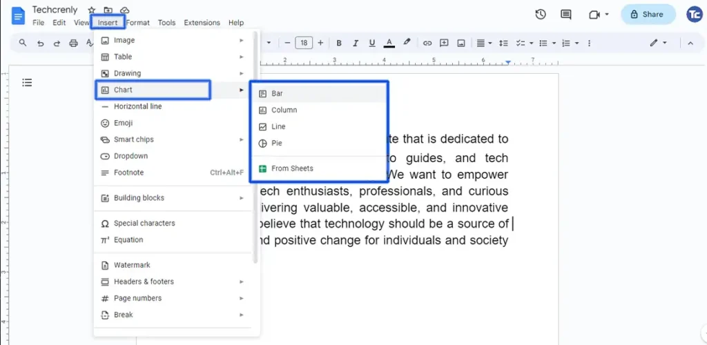
2. Click on Insert in the top menu. From the dropdown menu, hover over Chart then select the type of chart you want from the list (bar, line, pie, etc.)
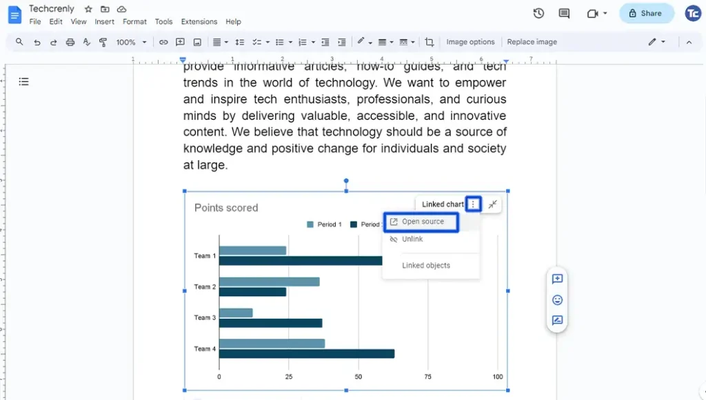
3. To edit the chart that you have chosen, click the three vertical dots and select Open source.
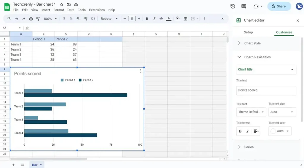
4. A new window will pop up. Here, you can enter your data directly in Google Sheets.
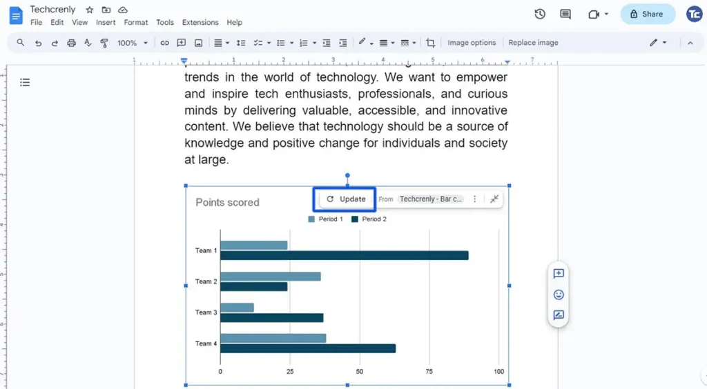
5. Once you’re done, go back to Google Docs and click on the Update button.
Final thoughts
After following this straightforward guide, you’ll realize that adding a chart to your Google Docs is an uncomplicated task.
The once daunting prospect of adding visual appeal to your documents will transform into a simple, step-by-step process.
This guide not only equips you with the technical know-how but also aims to instill confidence. Happy Charting!